Skip to content

How to Analyze an Image Rhetorically (+ Examples)

Image Analysis
Rhetorical analysis of an image involves examining and evaluating the visual elements and design choices within an image to understand how they communicate a message, persuade an audience, or convey a particular meaning. This analytical approach draws on principles from rhetorical theory, which traditionally focuses on analyzing written or spoken communication, and applies them to visual communication.

Key Elements & Steps

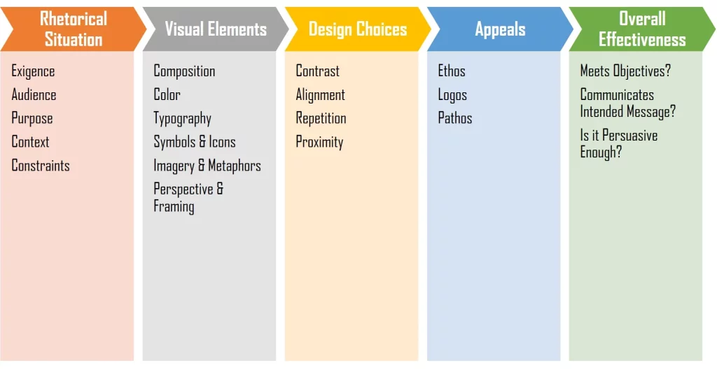
Here are some key elements and steps involved in conducting a rhetorical analysis of an image:

  1. Identify the Image’s Purpose: Begin by considering why the image was created. Is it meant to inform, persuade, entertain, provoke thought, or evoke emotions? Understanding the purpose of the image is crucial to analyzing its rhetorical strategies.
  2. Contextualize the Image: Examine the broader context in which the image is presented. Consider where and when it was published or displayed, as well as the intended audience. Context can significantly influence how an image is interpreted.
  3. Analyze Visual Elements:
    • Composition: Study the arrangement of visual elements within the image. Look at the balance, symmetry, and focal points.
    • Color: Analyze the colors used and their symbolism or emotional impact.
    • Typography (if applicable): Evaluate the fonts, text size, and text placement within the image.
    • Symbols and Icons: Identify any symbols or icons used and their significance.
    • Imagery and Metaphors: Consider the use of metaphors or visual representations to convey abstract ideas.
    • Perspective and Framing: Analyze how the image’s perspective, angle, and framing affect its message.
  4. Assess Design Choices:
    • Contrast: Evaluate the use of contrast to draw attention to specific elements.
    • Alignment: Analyze how alignment and visual hierarchy guide the viewer’s eye.
    • Repetition: Identify any recurring visual motifs or patterns.
    • Proximity: Consider how the placement of elements relative to each other affects meaning.
  5. Identify Appeals:
    • Ethos: Does the image establish credibility or trustworthiness?
    • Pathos: How does the image appeal to the emotions and feelings of the audience?
    • Logos: Does the image employ logical reasoning or evidence to support its message?
  6. Consider the Cultural and Historical Context: Be aware of any cultural or historical references that may influence the image’s interpretation. Certain symbols or references may have different meanings in different contexts.
  7. Interpret the Message: Based on your analysis of the visual elements, design choices, and appeals, interpret the overall message or argument conveyed by the image.
  8. Evaluate Effectiveness: Assess how well the image achieves its rhetorical goals. Consider whether it effectively communicates its message to the intended audience and whether it persuades or engages viewers as intended.

Rhetorical analysis of images is a valuable skill in fields such as advertising, art criticism, media studies, and visual communication, as it helps individuals understand how visual elements are used to convey messages and shape perceptions. It can also be applied to various types of images, including advertisements, political cartoons, photographs, paintings, and more.

Examples

  1. Rosie the Riveter Poster:
    1. Purpose: To inspire and encourage women to work in factories during World War II.
    2. Visual Elements:
      • Composition: Rosie is shown as a strong and determined woman, flexing her arm and rolling up her sleeve.
      • Color: Bold red and blue colors evoke patriotism and strength.
      • Typography: The text, “We Can Do It!” is in a strong, bold font.
      • Symbolism: Rosie’s pose symbolizes female empowerment and the ability to contribute to the war effort.
    3. Design Choices:
      • Contrast: The contrast between Rosie’s confident pose and the empowering text draws attention.
      • Alignment: The text is aligned below Rosie, reinforcing the message.
      • Repetition: Rosie’s determined facial expression is repeated throughout various posters.
      • Proximity: The proximity of the text to Rosie reinforces the message.
    4. Appeals:
      • Ethos: Rosie represents the strong and capable American woman.
      • Pathos: The image appeals to viewers’ emotions by portraying strength and unity.
      • Logos: The text, “We Can Do It!” uses logical persuasion.
  2. Apple Logo:
    1. Purpose: To establish brand identity and communicate innovation and simplicity.
    2. Visual Elements:
      • Composition: A simple apple shape with a bite taken out.
      • Color: A sleek, monochromatic color scheme (usually silver or black).
      • Symbolism: The apple represents knowledge and innovation.
    3. Design Choices:
      • Contrast: The clean, minimalistic design contrasts with complex logos.
      • Alignment: The logo is centered and balanced.
      • Repetition: The logo appears consistently across Apple’s products.
      • Proximity: The bite mark is close to the apple, drawing attention.
    4. Appeals:
      • Ethos: Apple conveys a sense of quality and innovation.
      • Pathos: The simplicity and elegance of the logo evoke positive emotions.
      • Logos: It suggests that using Apple products is a logical choice for tech users.
  3. “Hope” Poster (Barack Obama 2008 Campaign):
    1. Purpose: To promote Barack Obama’s candidacy and inspire hope.
    2. Visual Elements:
      • Composition: A stylized image of Barack Obama’s face with the word “Hope” underneath.
      • Color: A vibrant, patriotic color palette with red, white, and blue.
      • Typography: The font is modern and clean.
    3. Design Choices:
      • Contrast: The bold colors and the word “Hope” stand out.
      • Alignment: The text is aligned below the image, reinforcing the message.
      • Repetition: The “Hope” message was widely reproduced.
      • Proximity: The text is in close proximity to Obama’s face.
    4. Appeals:
      • Ethos: Obama is portrayed as a hopeful and trustworthy candidate.
      • Pathos: The image evokes positive emotions of hope and change.
      • Logos: It suggests that supporting Obama is a logical choice for a better future.
  4. “I Want You” Uncle Sam Poster:
    1. Purpose: To encourage recruitment and support for the U.S. Army during World War I and World War II.
    2. Visual Elements:
      • Composition: Uncle Sam pointing directly at the viewer.
      • Color: A patriotic color scheme of red, white, and blue.
      • Typography: The text uses bold, attention-grabbing fonts.
    3. Design Choices:
      • Contrast: Uncle Sam’s pointing gesture and the text create contrast.
      • Alignment: The text is aligned below Uncle Sam.
      • Repetition: The image of Uncle Sam was used in various forms.
      • Proximity: The text is closely placed under the image.
    4. Appeals:
      • Ethos: Uncle Sam represents the U.S. government and its call to duty.
      • Pathos: The image appeals to viewers’ sense of duty and patriotism.
      • Logos: It suggests that joining the Army is a logical response to the call.
  5. “Dove Real Beauty” Campaign Image:
    1. Purpose: To challenge conventional beauty standards and promote a positive body image.
    2. Visual Elements:
      • Composition: Features diverse women of various body shapes and sizes.
      • Color: Soft, natural colors to convey authenticity.
      • Typography: Minimalist fonts with messages like “Real Beauty” or “You Are Beautiful.”
    3. Design Choices:
      • Contrast: The diversity of the models contrasts with traditional beauty advertisements.
      • Alignment: The text is often aligned with the models or placed near them.
      • Repetition: The campaign uses multiple images with a similar message.
      • Proximity: The text is in proximity to the models, emphasizing the message.
    4. Appeals:
      • Ethos: The campaign challenges beauty industry standards.
      • Pathos: It aims to boost self-esteem and positive emotions in viewers.
      • Logos: It argues for a more realistic and inclusive definition of beauty.
  6. “No More Plastic Bags” Environmental Campaign Poster:
    1. Purpose: To raise awareness about the environmental impact of plastic bags and promote the use of reusable bags.
    2. Visual Elements:
      • Composition: A powerful image of a distressed sea turtle tangled in a plastic bag.
      • Color: Natural colors for the sea turtle contrasted with the stark white plastic bag.
      • Typography: Simple, bold text advocating against plastic bags.
    3. Design Choices:
      • Contrast: The stark contrast between the suffering turtle and the plastic bag grabs attention.
      • Alignment: The text is aligned below the image, reinforcing the message.
      • Repetition: The image is part of a larger campaign with similar visuals.
      • Proximity: The text is in close proximity to the image, emphasizing the message.
    4. Appeals:
      • Ethos: The campaign advocates for environmental responsibility.
      • Pathos: The distressing image evokes emotions and empathy.
      • Logos: It argues logically for the reduction of plastic bag usage.
  7. “Black Lives Matter” Protest Sign:
    1. Purpose: To advocate for racial justice and equality in the wake of racial violence and discrimination.
    2. Visual Elements:
      • Composition: Bold, impactful lettering spelling out “Black Lives Matter.”
      • Color: Black text on a yellow background for high visibility.
      • Typography: A strong, sans-serif font.
    3. Design Choices:
      • Contrast: The high-contrast color scheme and message make it visually striking.
      • Alignment: The text is centered, making it easy to read.
      • Repetition: The slogan is used consistently across the movement.
      • Proximity: The words are close together, reinforcing unity.
    4. Appeals:
      • Ethos: The message represents a call for justice and equality.
      • Pathos: It elicits strong emotions related to social justice and equality.
      • Logos: It logically asserts the importance of recognizing black lives.
  8. “Vote” Political Campaign Poster:
    1. Purpose: To encourage voter participation and support a political candidate.
    2. Visual Elements:
      • Composition: A patriotic image featuring the candidate, the American flag, and the word “Vote.”
      • Color: Red, white, and blue colors for a patriotic theme.
      • Typography: Bold, uppercase text for emphasis.
    3. Design Choices:
      • Contrast: The candidate’s image stands out against the flag background.
      • Alignment: The text is aligned below the image, emphasizing the call to action.
      • Repetition: The “Vote” message is used consistently in campaign materials.
      • Proximity: The text is in close proximity to the candidate’s image.
    4. Appeals:
      • Ethos: The candidate is presented as a patriotic choice.
      • Pathos: The image and message aim to inspire feelings of civic duty.
      • Logos: It logically urges citizens to exercise their right to vote.
  9. “Save the Children” Charity Advertisement:
    1. Purpose: To solicit donations for a charity focused on helping disadvantaged children.
    2. Visual Elements:
      • Composition: A poignant image of a malnourished child in need of assistance.
      • Color: Desaturated colors to evoke a sense of urgency and sympathy.
      • Typography: Simple, heartfelt text describing the cause.
    3. Design Choices:
      • Contrast: The stark contrast between the child’s suffering and the message is attention-grabbing.
      • Alignment: The text is aligned below the image, emphasizing the plea for help.
      • Repetition: Similar images and messages are used in various advertisements.
      • Proximity: The text is in close proximity to the image, reinforcing the message.
    4. Appeals:
      • Ethos: The charity appeals to viewers’ sense of compassion and moral duty.
      • Pathos: The image elicits strong emotions and empathy for the child’s plight.
      • Logos: It logically calls for support to address the issue of child suffering.
  10. “Just Do It” Nike Advertisement:
    1. Purpose: To promote the Nike brand and motivate athletes and consumers.
    2. Visual Elements:
      • Composition: Features a prominent Nike swoosh logo and the tagline “Just Do It.”
      • Color: Bold and contrasting colors, often black and white.
      • Typography: A strong, bold font for the tagline.
    3. Design Choices:
      • Contrast: The Nike swoosh and tagline contrast with the background.
      • Alignment: The tagline is usually below the Nike swoosh, emphasizing the message.
      • Repetition: The “Just Do It” tagline is consistently used in Nike’s branding.
      • Proximity: The text is in close proximity to the Nike swoosh.
    4. Appeals:
      • Ethos: Nike is associated with athletic success and determination.
      • Pathos: The tagline motivates and inspires a sense of action.
      • Logos: It logically encourages consumers to take action and make a choice.

These examples illustrate how visual elements, design choices, and rhetorical appeals are used to convey messages and persuade audiences in various contexts. Rhetorical analysis helps uncover the persuasive strategies at play in these images.